Add eye-catching images to your blog easily with Pablo.
Once upon a time, blogging was all about writing. If your stories were well-written, captivating, and the information shared was useful, you were a star of the blogosphere. They were great times, but like anything else in life, things evolve.
One of the many revolutions that happened in the past years was the growth of imagery in blogging.
In the beginning, any picture was OK, but with Pinterest, things changed completely. Your images can’t be just beautiful; they have to be eye-catching and pinnable, as well. Besides, new social media platforms emerged requiring visuals to your arsenal.
But what does this blog history class mean to you, blogger?

First of all, to make your blog awesome, you need to have awesome images.
People don’t have the time to read everything single post they would love to. So even before screening an article, they filter it by the looks. Text only posts are frequently skipped.
Needless to say that it adds new tasks to the daily checklist of bloggers. After writing and editing your content, you now must also think of the images.
Different image sizes
Depending on the layout of your blog, you may use vertical (Pinterest-size) or horizontal (Facebook and Twitter) images.
Squared ones are ideal for Instagram. The format is not mandatory anymore on IG, but it still fits better on your profile.
Google Plus is a little bit more flexible when it comes to images. Facebook Open Graph size works as well as any other dimension.
Now, if you follow the tips above, you have to create at least 3 different images (or versions of the same image) to get the most out of your content.
Before you start to feel concerned about the amount of time it will take, I have some good news for you.
Pablo
Picture this: one tool where you could easily upload the background of your choice, edit and resize it in less than 30 seconds.
It’d be great, wouldn’t it? And the best part is that it’s possible, and it’s called Pablo.
Pablo is an online image editing tool. It offers 3 sizes: tall, square and wide.
Thanks to its intuitive system, what you see is what you get. You can choose to upload your own images, or use the ones offered free.
If you use Buffer as a scheduling tool, you plan your posts straight from Pablo, as well.
How Pablo works
You can access Pablo through a direct link or, if you are a Google Chrome user, through its browser add-on.
On the homepage, you already get all the available options. There’s not dropdown or extra menu which makes it user-friendly.
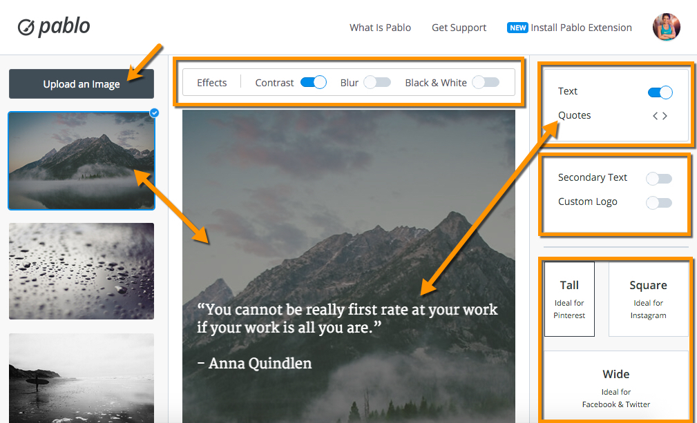
Images
You can start by whether uploading your own image (up to 3Mb) or choosing one of the available ones.
It’s possible to edit the contrast of the pictures and make them black and white. If you prefer a blurry background, it’s one touch away.
You can also add your brand’s logo to the image.
Text
If you want to create a motivational image with a quote, you can use the prompts provided by the tool. Or you can type your own text.
With the browser extension it’s possible to extract a fragment for the Internet as well. Select a text from any website and create an image with Pablo right from there.
Pablo offers a couple of fonts you can choose from and same basic editing option such as bold and italics.

Sizes
Instead of trying to figure out what sizes to use for the best-known platforms, the guys from Buffer have already done it for you.
Despite the fact that Pablo itself only offers 3 options, they are enough to cover most of the social media platforms on the market.
Sharing
Buffer users can schedule the images right from Pablo to the social media platforms added to the service.
For Instagram and non-Buffer users, it’s necessary to download the image first, though.
Pros
Pablo is probably the easiest image editor online you’ll find out there. It makes possible to anyone, tech savvy or not, to produce incredibly pleasing images in just a couple of seconds.
The learning curving is minimal, and it’s free.
You can schedule your sharing right from the tool.
Cons
Those who already have some experience with image editing might find Pablo limited.
You only have 2 text colors available, and you cannot add more fonts.
The filters are whether on or off. You can’t calibrate them half way, for example.
While it offers 3 sizes, there’s no custom option.
Final thoughts
Pablo might not be the go-to tool for experts in graphic design. However, if you are a blogger who struggles with your images, it’s for sure the right place to start.
There’s already so many tasks to cover in blogging that working smarter and not harder is the only solution.
Having attracting images on your posts and social media platforms isn’t optional anymore if you want to make your blog awesome.
If you don’t have any experience with design, Pablo is without a doubt the best alternative out there.
 10 Free and Legal Stock Image Sites for Bloggers
 How To Use Buffer To Boost Your Instagram Following
 Promote Your Content on Social Media Fast and Easy with Buffer